Updated December 4, 2020
“#MaskUp folks. We haven’t even seen the worst yet.” – Dr. Eric Feigl-Ding, sharing our map on Twitter.
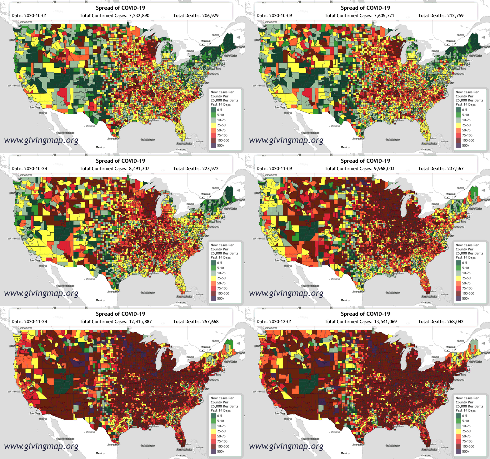
This summer Givingmap.org created an interactive, dynamic map to show the areas of the country that were hardest hit. We used a simple color code—green for counties with few or no cases per 25,000 residents, and yellow, orange and red for counties harder hit.

Two weeks ago, we woke up to the reality that our map was more than half red. The color coding system of the Giving Map is not just informational. It is designed to give concerned individuals a way to connect with communities in need. With this in mind, we have introduced a new color category: “code purple,” designating the parts of the country with the highest rates of COVID-19 infection. As of today more than 40 counties across the United States qualify as “Code Purple.”
Watch this time lapse animation to see how the infection has worsened across the continental United States this fall:
Watch Fall 2020 Time Lapse Animation on YouTube
Watch Eight-Month Time Lapse Animation (April – December 2020) on YouTube
We are faced with the reality that for every one case of COVID-19 reported, between five and ten people may be spreading the virus without showing symptoms or knowing that they have it. It’s no secret that Coronavirus infection rates are spiraling out of control in the United States, with over 1 million new infections in the past week and over 9,000 deaths. But certain places in the United States have been hit much harder than others. Most of these are in the Midwest, West, and South: the “Heartland of America.” Many are rural areas. View List of Top 200 Counties with the Highest COVID-19 Infection Rates.
Not everyone understands the risks of travel in this holiday season. Please stay safe and do what you can to educate others.
Tess Gadwa
Program Director
Givingmap.org
Data Source: Johns Hopkins University

